Mapping the course of climate change
A new mapping application helps visualize projected climate change by comparing the projected climate of a city with the current climate in alternate locations, helping people to develop an understanding about global warming and its effects.

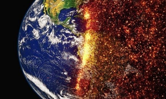
A climate change map application that visualizes the effects of climate change on North American cities, by mapping out the locations with current climates that represent the climate expected to be present in a specific city by 2080, has been developed by researchers at the University of Maryland Center for Environmental Science (MD, USA). This research, led by Matt Fitzpatrick, could help the public understand more about global warming and its direct impact on their cities.
Climates experienced in large areas of North America that have remained fairly constant over the last few generations are projected to change to mirror the climates of locations hundreds of miles away within the space of one generation. “Many cities could experience climates with no modern equivalent in North America,” stated Fitzpatrick.
In order to help people conceptualize this change and to understand more about global warming, Fitzpatrick and his team set out to design an interactive climate change map that displays a specific city and indicates the locations that currently possess a climate that matches the expected future climate of the selected city.
“It’s my hope that people have that ‘wow’ moment, and it sinks in for the first time the scale of the changes we’re expecting in a single generation.”
To assemble this application, the research team analyzed 540 urban areas in North America studying a total area that included the residence of 250 million American and Canadian citizens. For each of these areas, the team matched the expected climate to the present-day climate in other locations based on 12 measures of climate, which include temperature and precipitation during each of the 4 seasons.
“We can use this technique to translate a future forecast into something we can better conceptualize and link to our own experiences,” commented Fitzpatrick. “It’s my hope that people have that ‘wow’ moment, and it sinks in for the first time the scale of the changes we’re expecting in a single generation.”
The map indicates that on average, by 2080, the climate of cities in North America will resemble that of cities over 500 miles away, mostly towards the south. For instance, in eastern areas such as New York, Boston and Philadelphia, the climate will resemble that currently in place in the south and southwest, while in Miami (FL, USA) the climate will resemble that of present-day San Blas Atempa (Mexico).
“Similar efforts to communicate climate change often focus on temperature only, but climate is more than just temperature. It also includes the amount of precipitation an area receives, when it falls during the year, and how much arrives as snow versus rain,” explained Fitzpatrick. “Climate change will lead to not only warming, but also will alter precipitation patterns.”
With climate change ever a contentious issue, the hope is that with the development of applications such as this, scientists can better communicate their findings in a simple fashion to help people better understand global warming and to eventually affect public opinion and potentially policy.
Find your city on the application here